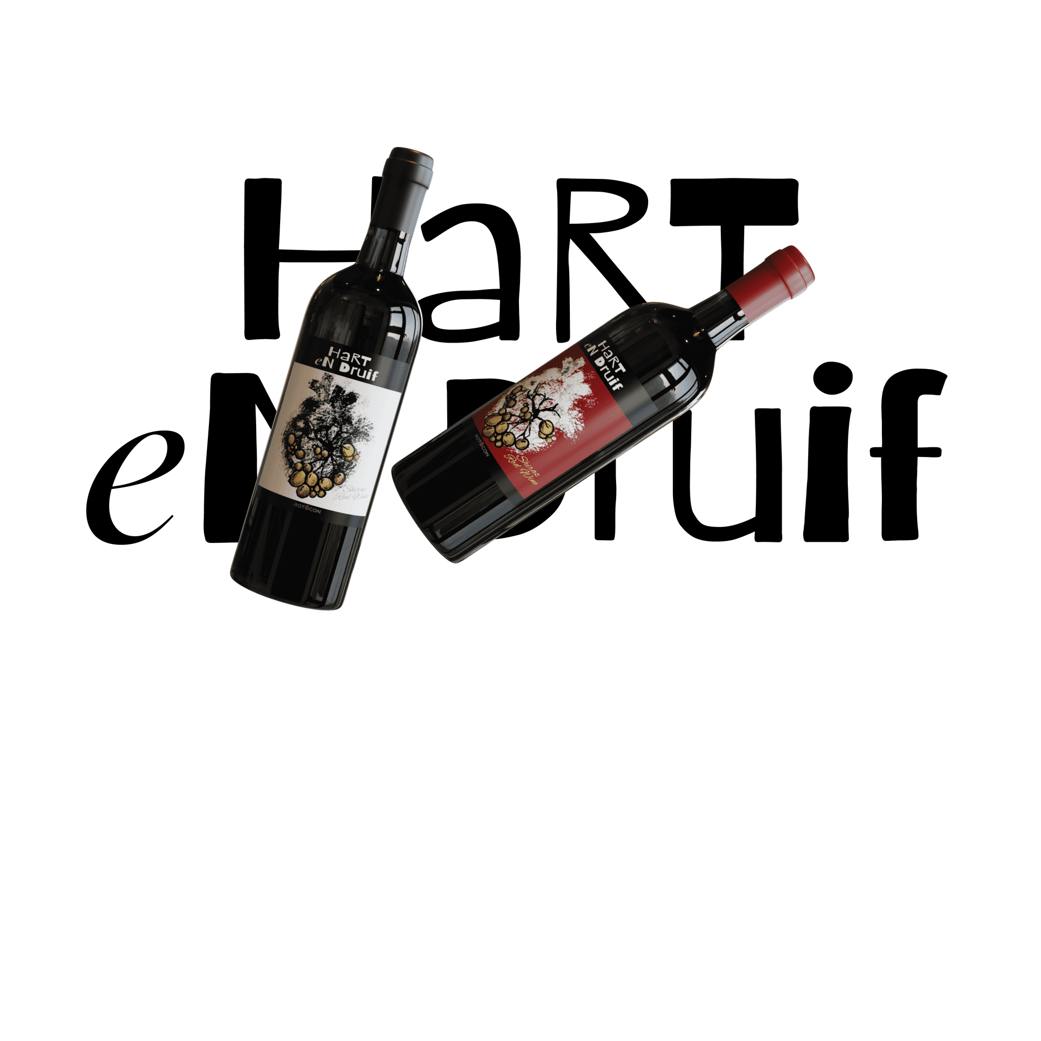
Hart En Druif
As part of a competition for Rotocon, I designed Hart en Druif, a wine label concept that combines elegance with a contemporary edge. The design draws on the name’s meaning — “Heart and Grape” — to visually capture the passion, craftsmanship, and natural beauty behind winemaking.
Client
Rotocon
Service Provided
Product Design
The Goal:
To create a sophisticated and visually striking wine label that stands out on the shelf while reflecting the brand’s essence and appealing to a premium market.
1

The Challenge:
Develop a design that balances modern appeal with timeless elegance, ensuring it meets industry standards for wine packaging while also offering a fresh, competition-ready concept.
2

The Result
Produced a distinctive label design with refined typography, rich textures, and thoughtful symbolism that conveyed both the heritage and artistry of winemaking. The concept demonstrated strong shelf presence and the ability to compete in a professional market setting.
3